|
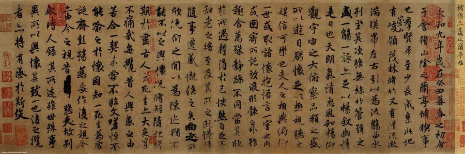 |
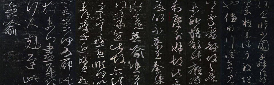
Lantingxu
(Preface to Orchid Pavilion), the Most Renowned Calligraphy Work
by Wang Xi Zhi in the Jing Dynasty |
With the evolution of script, rules and technique of calligraphy also changed. Finally, calligraphy developed into a kind of art with different styles and schools and formed an important part of Chinese culture.
The development history of Chinese calligraphy can be roughly divided into three periods. The Pre-Qin Period (before 221BC) is the first period. The Mature Period from Western Han Dynasty (206BC-24AD) to the Tang Dynasty (618AD-907AD) is the second period. The Individualistic Period from the Five Dynasties (907AD-960AD) to the end of the Qing Dynasty (1644AD-1911AD) is the third period.
If you have interest in the high quality copy of Lantingxu calligraphy please contact me.
First period
Jiaguwen (Oracle Bone Inscriptions) discovered in Anyang
in 1899AD was regarded as the most ancient characters in China. Inscriptions
on oracle bones were widely considered to be one of the earliest forms
of writing as early as 3,600 years ago during the Shang Dynasty in ancient
China. The Shang people believed in ghosts and spirits and they always
made divinations. These inscriptions carved on tortoise shell and animal
scapulae were used to record the auspicious or inauspicious results of
the divinations. The contents of inscriptions on oracle bones concerned
the Shang Dynasty’s wars, agriculture, mythology, history, and so on and
revealed all aspects of their daily life. Probably it is the origin of
Chinese calligraphy.
Zhongdingwen also called jinwen (inscriptions on bronze
vessels), appeared in the late of Shang Dynasty (1600BC-1100BC) were regarded
as the development of jiaguwen. During the Shang and Zhou Dynasties, bells,
tripods and vessels became ritual objects and symbols of power and social
status of slave-owning aristocrats. At the beginning only the names of
the owners were cast or engraved on the tripods. Later the tripods and
other bronze vessels had longer inscriptions stating the usage and date
of being cast. The contents might include wars, treaties, agriculture,
and history. Thus the inscriptions on bronze objects grew longer, from
a few characters to hundreds, from simple phrases or pictures to detailed
statements and treaties and the varieties of calligraphy styles increased.
At this time another form of writing called Kegouwen (tadpole script),
which was painted on bamboo slips.
Dazhuan (great seal script) also appeared In the West
Zhou Dynasty and it was the transitional type of jiaguwen and xiaozhuan
(small seal script). Shiguwen (Stone Drum Inscriptions) appeared in the
Autumn Spring and Warring State Period (770BC-221BC) is the best representative
of Dazhuan. Shiguwen was so named because the characters were engraved
onto the tops and sides of ten large stones shaped like drums. These drums
opened an important era of Chinese calligraphy and are the first known
examples of Chinese calligraphy engraved onto stone.
Xiao Zhuan: In the year of 221BC, Emperor Qinshihuang
first time unified China. He ordered his minister Lisi to standardize
Chinese different scripts into Xiaozhuan (small seal script). Taishankeshi
(stone inscription on Mount Tai) was the best example of xiaozhuan in
that period of time. Lishu (official script) also appeared in the short
Qin Dynasty (221UC-206BC) but it was well developed in the Han Dynasty
(206BC-220AD).
The second period
The second period spanned over one millennium from the Western Han Dynasty
to the end of the Tang Dynasty. Calligraphy achieved great accomplishments
during this period of time and became mature.
Lishu was predominant script in the Han Dynasty. The
strokes of lishu are straight and angular, which was much easier than
xiaozhuan. In the Eastern Han Dynasty, bafenshu was invented with the
characteristic of right and left sides of a character turning against
each other. The most famous calligrapher was Cai Yong with the representative
work called xipingshijing (the stone classic of Xiping Emperor). The structural
design of Lishu is somewhat similar to Zhuanshu. Their principles focus
on the spacing between strokes. The spacing and position of strokes are
well designed to render a sense of elegance and beauty. Basic features
and rules of Lishu include:
If a character contains a horizontal stroke, its ending at the right side
resembles a wave. This is called the Bird Tail. However, only one Bird
Tail is usually allowed for one character even if that character has more
than one horizontal stroke. This rule is literally translated as: “ No
two bird tails will fly together.” However, we may have two Bird Tails
with one less obvious than the main one.
 |
Lishu
calligraphy Work |
If a character has two or three horizontal
strokes, the bottom one rather than the upper one will usually be the
Bird Tail to support the upper part of the character. This will render
a sense of stability. Otherwise, the heavy head might collapse the character’s
structure. However, if the horizontal stroke is the longer one and it
happens to be in the top portion of a character, it is the Bird Tail.
The shorter ones in the lower part of the character are not Bird Tails.
There are rare exceptions when a character will have two Bird Tails. This
should still make the character look stable and not double-weighted.
In a Lishu work, not all of the characters will be of the same height.
That is, the ratio of length of width to height may be different among
several characters in a work. Calligraphers usually justify all characters
to the top (“Qishang”). That means that the top strokes of characters
should be in the same height.
If the stroke is “Na ” (going in a southeast direction), it will be the
Bird Tail.
kaishu (regular script) became important and widely use
by governmental officials and scholars from the Wei and Jin Dynasty (220AD-420AD).
Zhong Yao was considered the inventor of kaishu. The regular writing of
kaishu is square in form, non-cursive in style. The strokes of script
consist of 8 kinds: the dot, the horizontal, the vertical, the hook, the
rising, the left falling and the right falling. Later on Chinese calligraphers
believed kaishu was the foundation of practicing calligraphy work.
For Kaishu writing, the character has to be tall. The ratio of length
of height to width is about 3 to 2. Symmetric. Left and right sides of
a character are usually symmetric. Vertical strokes are straight. Horizontal
strokes are flat. Curves and circles are smooth, not rugged. Spacing between
strokes is adequately and delicately designed. Strokes don’t usually vary
in thickness and thinness.
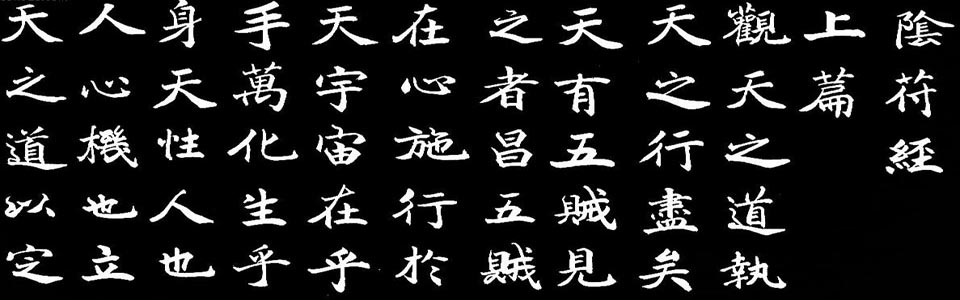 |
Kaishu
Calligraphy Work |
Xingshu (walking hand) was a changing form of lishu. The style was created by Liu Desheng in the late of Estern Han Dynasty. A calligraphy work in Xingshu will look more smooth, connecting and faster than Kaishu, but less than Caoshu. This is why xingshu is known as Walking Style and Caoshu as Running Hand. Xingshu usually simplifies the strokes and changes the sequences of strokes from Kaishu writing. Sometimes a Xingshu calligrapher will mix some Caoshu or Kaishu with Xingshu. Wang Xizhi in the Jin Dynastry is a very brilliant Xingshu calligrapher. People called him “Sage of Calligraphy”. The inscription on Lanting Pavillion in the hand of Wnag Xizhi (321-379) was regarded as the best Xingshu calligraphy work.
 |
Xingshu
Calligraphy Work |
Caoshu (also known as Grass Style,
Running Script or Cursive Script) is the most simplified but
abstract and difficult form of writing in Chinese calligraphy. It was
developed almost at the same time with Li Shu. Since the Han Dynasty,
Li Shu and Tsao Shu were developed and established. From the Han Dynasty
to the JIN and Tang Dynasties, there were many famous Tsao Style calligraphers.
Tsao Shu reached one of its peaks during the Jin Dynasty when Wang XIzhi
and his son, Wang Xianzhi, were both good at this style. The father and
son are referred as "the Two Wangs" in the Chinese calligraphy
history. They influenced later calligraphers in each dynasty, especially
for Xing and Cao Styles. Later in the Tang Dynasty, two great calligraphers
Zhang Xu and Huai Su, were both reaching another peak in Caoshu.
Cao Style is generally considered the most difficult style among all five
major Chinese calligraphy styles. Calligraphers specializing in Cao Style
decreased in number since the Tang Dynasty. For Caoshu, especially Jincao
style, the characters are executed swiftly with strokes even connected.
The last stroke of fist character is always merged into the initial stroke
of the second character. The characters always vary in size when writing.
CaoShu is to simplify the characters. Thus a calligraphy work in Cao Style
will look more smooth, connecting and faster with abrupt turning and dramatic
effects.
 |
Caoshu
Calligraphy Work |
Caoshu was divided into Zhangcao, Jincao
and Kuangcao (creasy). Shiyou invented Zhangcao in the later Western Han
Dynasty and Zhangzhi developed Zhangcao into Jincao and who was called
“Sage of Cao Style”. In the Tang Dynasty, both Zhang Xu and Huai Su liked
to write Cao style calligraphy after getting drunk. They would yell, stride,
and show weird behaviors during their creation. They were peered as “Crazy
Zhang & Weird Monk”. They established a Cao Style commonly referred
as “Kongcao ” (“Kuang” means crazy and bold).
During the Tang Dynasty (618-907), Chinese calligraphy flourished and
reached its summit. From the Emperor to the common scholars almost everybody
attached great importance and passion on calligraphy art. Many great calligraphers
appeared such as Ouyang Xun, Liu Gongquan, Yu Shinan, YanZhenqing and
so on. Their calligraphic works are still used as calligraphy textbook
up to know.
The third period
After the Tang Dynasty, it was realized that only calligraphic works with
unique personal style could be recognized so the calligraphy works emphasized
on individualistic development. In the Song Dynasty (960-1279), Su Dongpo,
Huang Tingjian, Mi Fu, Cai Xiang are noted calligraphers. In the Yuan
Dynasty, Zhao Ziang’s Kaishu had great influence on the development
 |
 |
 |
 |
 |
 |
Calligraphy
A |
Calligraphy
B |
Calligraphy
C |
Calligraphy
D |
Calligraphy
E |
Calligraphy
F |
of calligraphy. In the Ming (1368-1644) and Qing Dynasty (1644-1911) more influential and brilliant calligraphers appeared like shining stars in the sky. Among them, Song Lian, Dong Qichang, Wen Zhengming, Jin Nong, He Shaoji, Wu Changshuo, Zheng Banqiao and Kang Youwei are very famous.
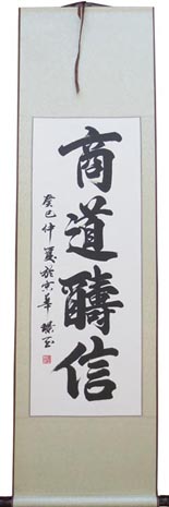
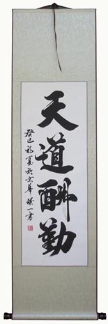
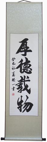
Here are a few Chinese calligraphy
work on sale. If you have interest you can contact me.
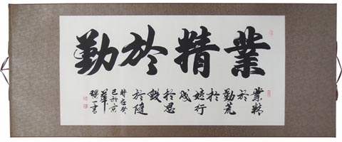
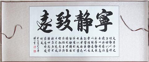
From calligraphy A to calligraphy F, all these works are in the same size. The scroll is 160cm high and 45cm wide. The center is 100cm by 34cm. Each piece costs 60USD including shipping. These Chinese characters are famous aphorism .Calligraphy A means “Excellence in work is possible only with diligence”. Calligraphy B means “Business profits depend on reputation”. Calligraphy C means “Hard work brings good profits”. Calligraphy D means “Be quiet and think”. Calligraphy E means “Great virtue carries the outer world”. Calligraphy F means “Tao models itself after nature”. If you want the bigger size we can also meet your demands.
 |
 |
Calligraphy
G |
Calligraphy
H |
 |
 |
Calligraphy
I |
Calligraphy
J |
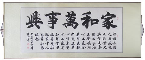
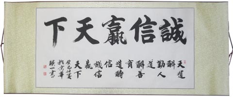
From calligraphy G to calligraphy J, all these works are in the same size. The scroll is 160cm wide and 60 cm high. The center is 100cm by 50cm. Each piece costs 70USD including shipping. These Chinese characters are famous aphorism .Calligraphy G means “If family lives in harmony, everything will prosper”. Calligraphy H means “Great reputation will win the world”. Calligraphy I means “Excellence in work is possible only with diligence”. Calligraphy J means “Accomplish something lasting by leading a quiet life”. If you want the bigger size we can also meet your demands.
Mobile:(+86-1350
110 3837) Wechat:(13501103837)
E-mail: chinasilkrug@msn.com